Lonnie Hutchinson's sista7
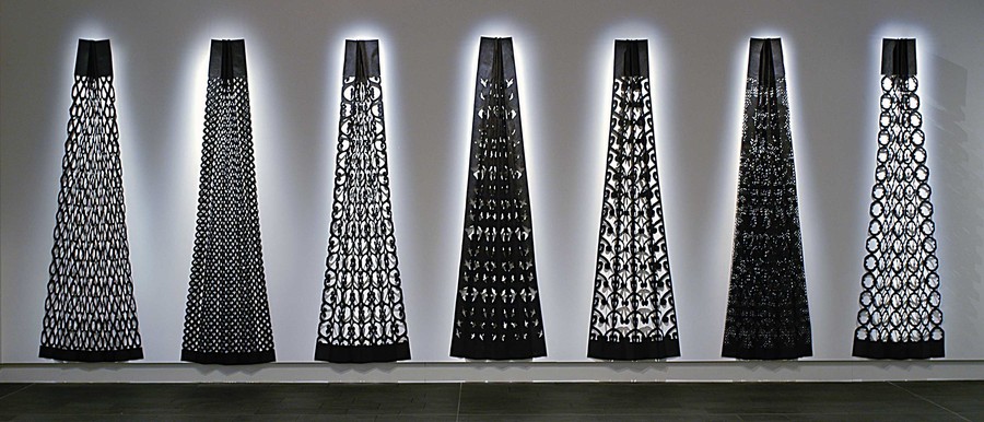
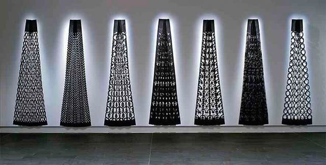
Lonnie Hutchinson Sista7 2003. Black building paper. Collection of Christchurch Art Gallery Te Puna o waiwhetū, purchased 2003. Reproduced with permission
I am writing about a favourite piece from the Gallery’s collection in autumn 2015, when that collection is in storage and the Gallery is closed at least until Christmas, so I’m prompting memory by consulting the online catalogue. It’s brilliant: hundreds of images, 90 percent of the entire 7,000 collection, but to be honest, it feels a bit odd.
Like childhood when art was rows of tiny thumbnail prints in grey or faded sepia in a Children’s Encyclopædia. Everything is the same size, a 950 x 1,980mm canvas by Gordon Crooks has the same weight as the 233 x 146mm Cruikshank cartoon nextdoor, just as online publication imposes the same shiny face and clean font over the Marmite smears and marginal scribblings of actual lived-in books.
So I resort instead to dodgy memory. I close my eyes and there it is: a row of black cones, cut from building paper. It stretches across a good part of the gallery wall, lit so that shadows of the patterns cut in the paper are reflected on white plaster. I remember them linked, like those paper dolls my dad made to amuse us. He’d fold a sheet of paper this way, that way, then cut out a little girl on the front with pigtails and outstretched hands, and flick! The paper unfolded into a whole row of little girls holding hands.
That’s how I recalled the cones. I couldn’t remember the name of the piece or the artist or their significance. So I Googled ‘Christchurch Gallery black building paper’ and there it was and it wasn’t as I remembered at all.
They were seven separate cones, and they were titled sista7, which referred to the seven volcanic cones the artist, Lonnie Hutchinson, could see from her studio by Lyttelton Harbour. I don’t recall having known that, just that I loved the stark beauty of the cutout patterns and their shadows. I have always loved black and white for the way it makes things serious and for the way it reveals structure.
And now that I know the cones’ proper name and their significance, I love them more for their melding of volcanic power with weaving and tattoo and the feminised landscape, created using a technique that retains the childhood enchantment with repeated patterns worked to a grander scale.
Scale is what I miss most online. There’s another piece that rises in dodgy memory, the red and black and white transformation of gallery space into a wharenui composed of huge words, in which Ms and Ws and As took on the square-legged stance of the ancestral figures and it was like walking into the very sound of ancient voices. I have to look that up too: it was Darryn George’s Pulse and it was astonishing.
Another favourite. The quakes have created undeniable limitation, but they have released scale on to the streets where artists have finally had big spaces to work with: Tjalling de Vries’s great wall of words, for example, torn from maps and newsprint, shredding in a southerly on the rear wall of CoCA.
That’s what I remember from the Gallery collection: scale, pattern and black building paper.
Related
film
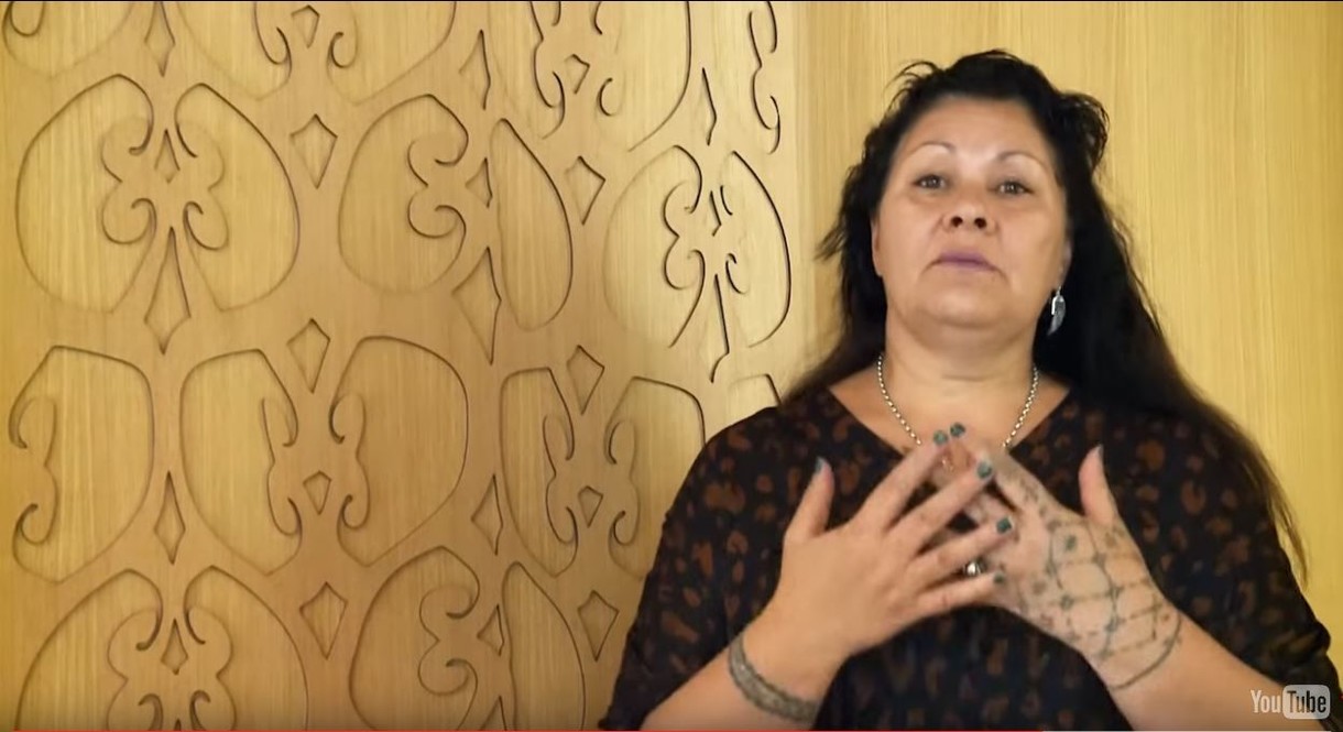
Lonnie Hutchinson speaks on the use of Te Reo in her work
For Te Wiki o Te Reo Māori / Māori Language Week 2015, Te Puna o Waiwhetū Christchurch Art Gallery invited five Māori artists to talk about the use of te reo in their work.
Exhibition
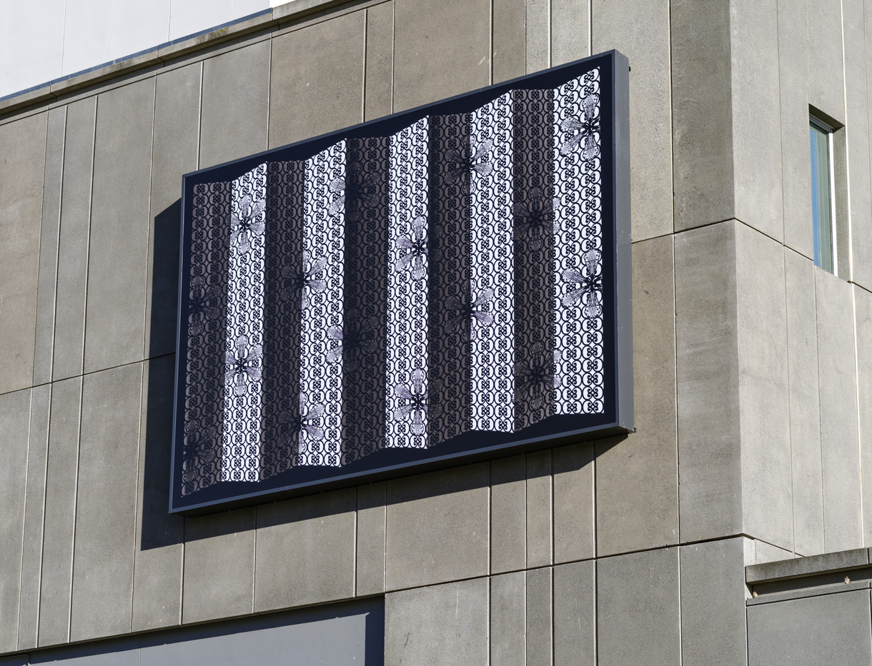
Lonnie Hutchinson: Hoa Kōhine (Girlfriend)
31 March 2024
Lonnie Hutchinson’s intricately cut-out billboard celebrates supportive friendships between women
Exhibition
Lonnie Hutchinson: Ahu Tīmataka / Trace Elements
31 October 2021
An exciting new project by celebrated Ngāi Tahu artist Lonnie Hutchinson.
Collection
Lonnie Hutchinson Sista7
From her studio window in the port town of Ōhinehou / Lyttelton, Lonnie Hutchinson could see the volcanic range commonly known as the Seven Sisters running along the back of Ōhinetahi / Governors Bay. A pivotal work in the artist’s career, Sista7 celebrates this evening vista and the sense of belonging she felt nestled in the rohe (territory) of Ngāti Wheke, the hapū (subtribe) based at nearby Rāpaki. The spiritual and cultural values of Hutchinson’s dual Samoan and Ngāi Tahu heritage are firmly embedded in her practice. Hand-cut in black builder’s paper, positive and negative elements recall the fundamentals of Polynesian and Māori design. The rhythm of folds and the elegant shadows cast by the motifs inspire a natural sense of wonder.
(Te Wheke, 2020)
The dimensions given here are for one of this work's seven individual parts. The spacing between each part, and thus the width of the entire work, can vary. In this image from the exhibition Te Puāwai o Ngāi Tahu (10 May – 24 August 2003), the parts are installed 300mm apart.