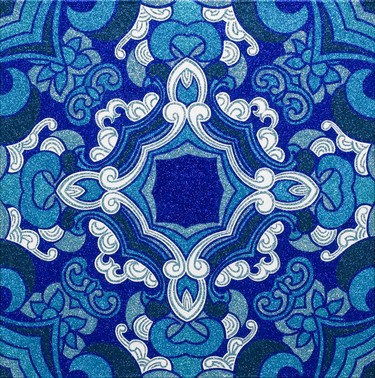
Reuben Paterson A Shadow Born from Three Dreams 2008–9. Glitter and acrylic on canvas. Private collection, Christchurch. Reproduced courtesy of the artist
New Zealand in the Biennale of Sydney and the Biennale of Sydney in New Zealand
and the Biennale of Sydney in New Zealand
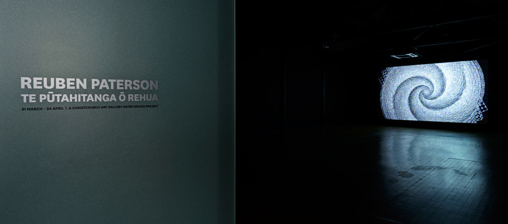
Call it a moment of uncanny curatorial synchronicity. Call it an alignment of the trans-Tasman curatorial stars. Or-calming down a bit-call it a minor but welcome coincidence. In Sydney from 12 May till 1 August, nine New Zealand artists go on show in the Biennale of Sydney-one of the largest contingents of Kiwis ever to take part in the nearest thing the South Pacific has to European megashows like documenta and the Venice Biennale.And across roughly the same timeframe, six of those artists are on show at Christchurch Art Gallery-Jason Greig, Julia Morison, Fiona Pardington, Reuben Paterson, Rohan Wealleans, and (in the Russell Crowe position, with a foot in both Australia and New Zealand) Daniel Crooks. (The other Kiwis taking part are Yvonne Todd, Brett Graham and Shane Cotton.)
Called The Beauty of Distance: Songs of Survival in a Precarious Age: The 17th Biennale of Sydney, artistic director David Elliott's edition of the show sure won't be winning any prizes for economy in exhibition titling. But it's impossible not to feel hopeful for a curator who takes as his touchstone Harry Smith's great 1952 collection of field-recordings, the Anthology of American Folk Music, and who says, with a welcome directness and absence of bet-hedging, that he wants to ‘explore the affirmative power of art in the face of unprecedented threats'.
International group-shows often bring out the worst in New Zealand commentators, who feel compelled for the zillionth time to wonder what exactly makes the New Zealand work distinctively ‘ours' (Hello, you want to respond, it's from New Zealand). We're doing our best here to avoid that kind of naffness. But it has to be said that Elliott's stated interests in tricksters, cabinets of curiosity, and ‘gods and ghosts' sit very comfortably indeed with the New Zealanders in his selection-particularly those who do their digging down at the dark end of the local cultural garden, like Cotton, Greig, Pardington and Wealleans. Of course, to see how the nine New Zealand artists harmonise or otherwise with Elliott's ‘songs of survival' theme, you need to get to Sydney and get amongst it. But if you can't, or even if you can, six of the nine are playing right now at the Gallery.
Justin Paton
Senior curator
Related reading: Julia Morison, Daniel Crooks, Shane Cotton, Yvonne Todd, Jason Greig, Op + Pop, Fiona Pardington
Exhibition
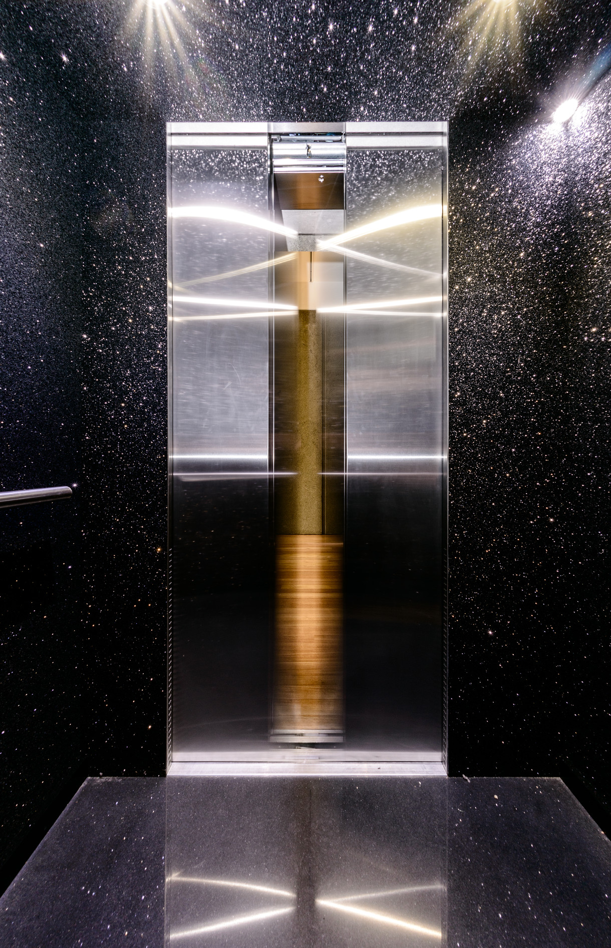
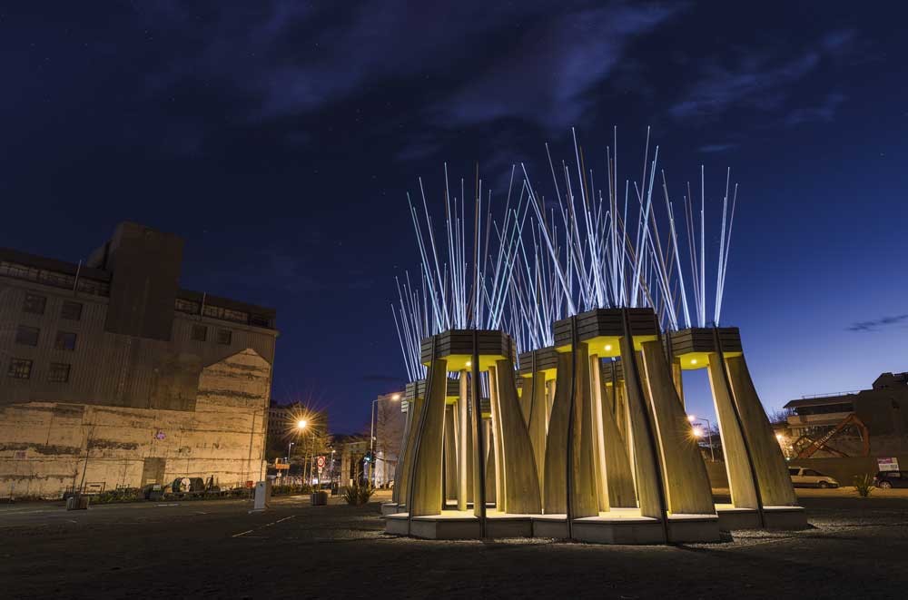
Reuben Paterson: The End
Ongoing
Reuben Paterson's sparkling elevator installation offers an unexpected space for contemplation and connection.
Notes
To the memory of Julian Dashper
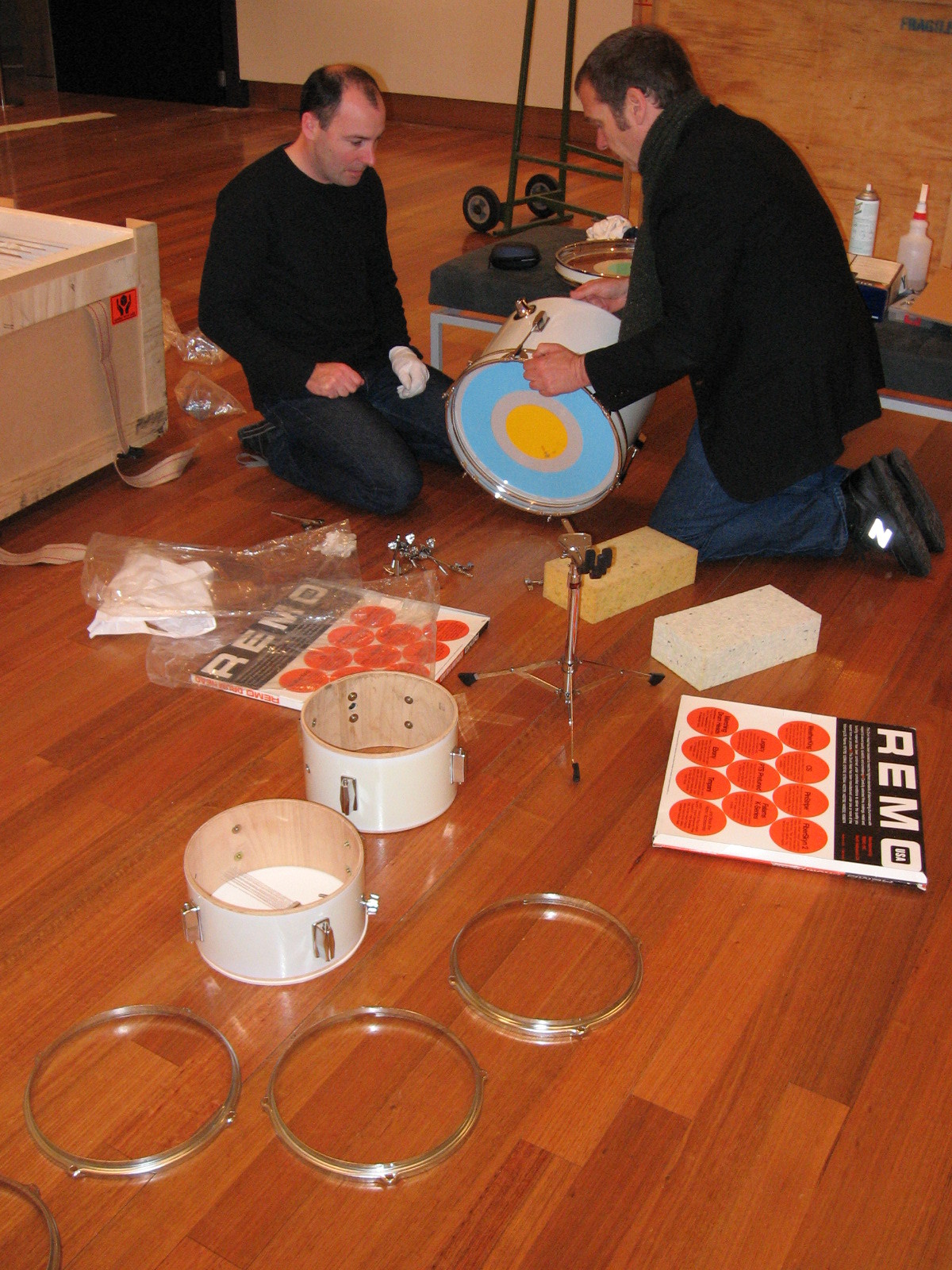
One of the highlights for staff over the eight or so years that the Christchurch Art Gallery was open prior to the shakes was the opportunity to work alongside Julian Dashper on his exhibition To The Unknown New Zealander.
Notes
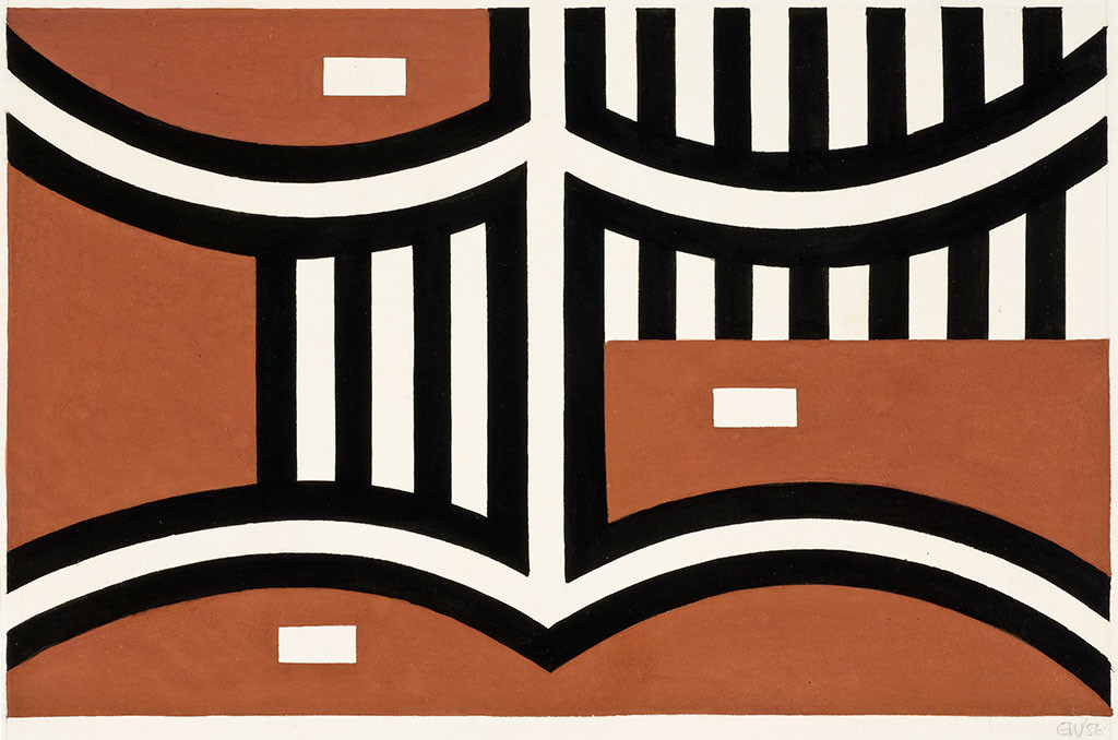
Untitled 1956 by Gordon Walters
This article first appeared as 'Balancing act' in The Press on 17 August 2012.
Notes
Glittering
When it comes to posting comprehensive pictures of your new exhibitions online, opinion is divided.
Notes
Selected proofs
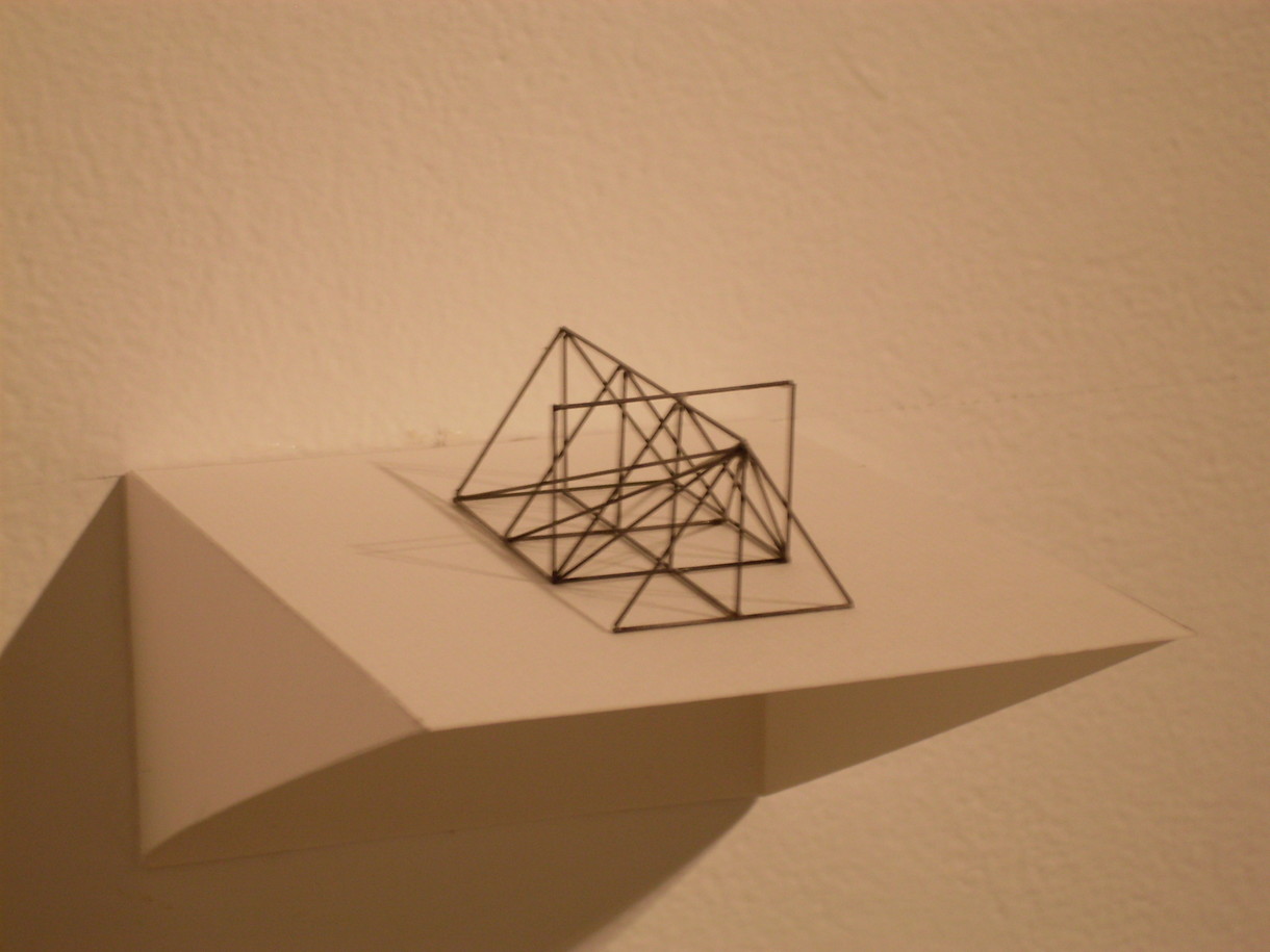
Peter Trevelyan's exhibition Selected Proofs is currently on at the University of Canterbury's SOFA Gallery until 7th September.
My Favourite
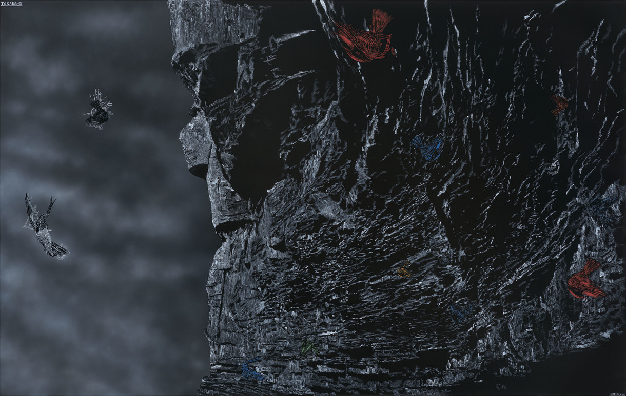
Shane Cotton's Takarangi
I grew up in the Motueka Valley at a place called Ngatimoti. The Peninsula Bridge crosses the Motueka river there. It carries one lane on a timber deck joining SH 61 to Peninsula Road and the west bank of the river. The bridge is 110 years old, still doing its job of daring every kid who grows up in its vicinity to climb the railing and take the leap one day – maybe thirty feet if the summer is hot and the river sedate and inviting. By the time I’m sixteen, I’m a veteran. Veterans don’t jump. We dive, head first, eyes open, arms outstretched. There must be grace in the art of falling.
Article
Stakes in the ground
Last, Loneliest, Loveliest is New Zealand's first official presence at the International Architecture Exhibition La Biennale di Venezia, and takes its alliterative title from Rudyard Kipling's poem, 'The Song of the Cities', which gives four lines each to various cities from the British Empire, including Auckland:
Last, loneliest, loveliest, exquisite, apart–
On us, on us the unswerving season smiles,
Who wonder 'mid our fern why men depart
To seek the Happy Isles!
Article
The pleasure of making: objects taking centre stage in the space of the art gallery
Was it serendipity that the opening of Christchurch Art Gallery's Burster Flipper Wobbler Dripper Spinner Stacker Shaker Maker coincided with that of Slip Cast, a group exhibition at the Dowse Art Museum that also focused on the pleasure that artists take in manipulating materials in the process of making art?
Article
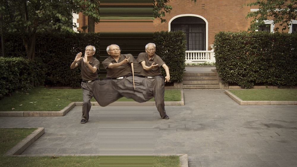
Seeking stillness in movement
Time didn't feel like it was on my side on the day I first saw Daniel Crooks's film Static No.12 (seek stillness in movement) (2009–10). In Sydney for just a couple of days to see the Biennale, I'd committed the cardinal mistake of the international art tourist and bitten off more culture than I had time to chew. By the time I reached Cockatoo Island and its dozens of exhibits, I was suffering from what might be called the Grumpiness of the Long-Distance Art Watcher – a state in which one doesn't absorb the artworks so much as check them off, feeling simultaneously fretful about my dwindling time and resentful about the sheer quantity of art. Though I hardly knew it then, this was the perfect state in which to test Crooks's video – a work that attempts, like no other I know, to induce an altered sense of time.
Article
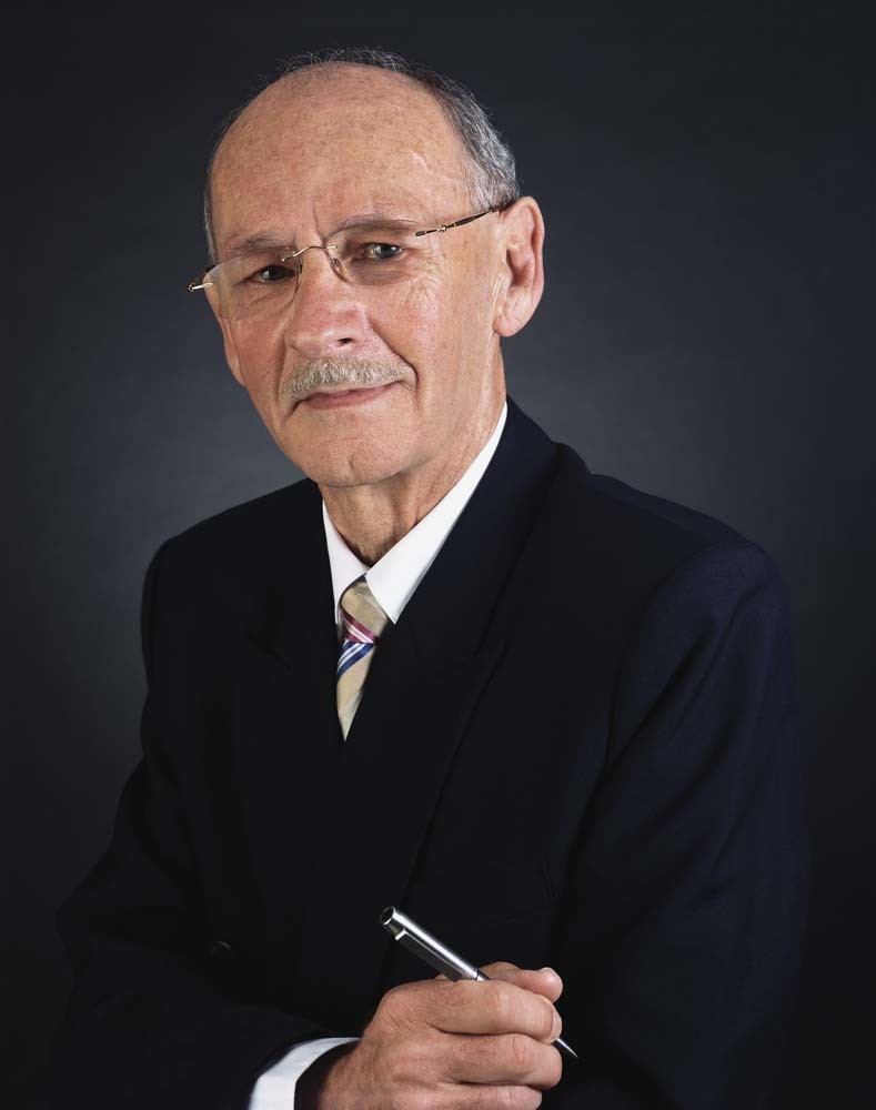
Yvonne Todd: The Wall of Man
A succinct ad placed in the classifieds of the North Shore Times in March 2009 attracted some forty applicants. Respondents were shown a photographic portrait of an unnamed executive, and directed towards ervon.com – artist Yvonne Todd's website – to decide whether or not they wanted to be photographed. Some still did. The unfolding story might not have been exactly what they'd expected, but all who agreed understood it would be something different. Next came the eliminations: sixteen men were chosen to be photographed; twelve made it to the final cut. The resulting images were printed at varying sizes and titled: International Sales Director, Retired Urologist, Family Doctor, Senior Executive, Hospital Director, Company Founder, Sales Executive, Chief Financial Officer, Image Consultant, Independent Manufacturing Director, Publisher, Agrichemical Spokesman. This is The Wall of Man.